Applying Color Psychology in Logos: Harnessing Color Theory for Memorable Logos
Color selection is more than aesthetic preference — it's a communicative tool that encapsulates brand essence and values before a single word is read. Every color choice in your logo should be an intentional act.
When you look at a logo, color is the first thing your brain processes. Before the shape registers, before the type reads, before the meaning lands — the color has already done its work. It has triggered an emotional response, activated a set of associations, and begun the process of placing your brand in a category in the viewer's mind.
Most designers know this. Fewer apply it rigorously. And even fewer apply it with the cultural specificity that transforms a good logo into a great one.
What Color Psychology Actually Studies
Color psychology is the study of how colors affect human behavior and perception. The foundational findings are well-established: red activates urgency and passion, blue communicates trust and stability, green signals growth and health, gold conveys prestige and heritage. These associations are real and documented across thousands of consumer behavior studies.
But here's the critical nuance that most logo design conversations miss: these associations are not universal. They are products of specific cultural contexts. White communicates purity in Western markets and mourning in several Asian traditions. Red is danger in some contexts and celebration in others. The meaning of color is always partially cultural, and a brand built for a specific community must understand the colorway of that community's experience — not the colorway of a general market study.
"Well-designed logos grounded in color psychology become visual ambassadors that build brand loyalty and remain relevant through market evolution."
The 70-20-10 Rule
Borrowed from interior design and adapted for brand identity, the 70-20-10 rule is one of the most practical frameworks for logo color composition. It creates visual harmony while ensuring brand colors work as a coherent system rather than a collection of individual choices.
The dominant color that defines your brand's visual identity across all applications.
Supports and complements the primary — used in headers, icons, and secondary elements.
Used sparingly for emphasis — CTAs, highlights, and moments that need to stop the eye.
Color Theory in Practice: Schemes and Systems
Color theory provides the mathematical backbone for color relationships. The two most useful schemes for logo design are:
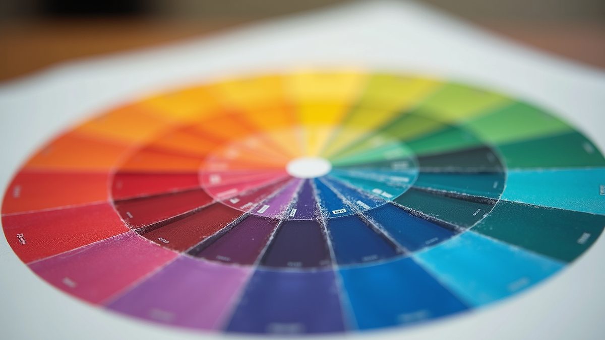
- Complementary colors — Colors opposite each other on the color wheel (e.g., blue and orange, purple and gold). They create high contrast and visual tension that can be powerful when used intentionally.
- Analogous colors — Colors adjacent on the color wheel. They create harmony and feel cohesive — useful when the brand message centers on trust, community, or calm.
Beyond scheme selection, saturation and brightness matter enormously. High-saturation colors feel energetic and youthful. Desaturated, muted tones feel mature and premium. Brightness determines weight — a dark, heavy color communicates authority; a light, airy tone communicates accessibility.
Six Practical Principles
- Research your audience's cultural context — What does each color mean within the specific community your brand serves? Don't assume general-market associations apply.
- Define your brand personality first — Color should express a personality you've already defined, not define a personality you haven't thought through.
- Limit to 2–3 colors maximum — More than three colors in a logo almost always signals amateur execution. Discipline creates strength.
- Test across media — A color that works beautifully on screen may fail in black-and-white print, on fabric, or embossed in metal. Test every application before committing.
- Consider color blindness accessibility — Approximately 8% of men and 0.5% of women have some form of color vision deficiency. Your logo must communicate without relying solely on hue differentiation.
- Use contrast intentionally — Contrast directs the eye. Where you create contrast, you create emphasis. Place it exactly where you want attention to land.
Color as Cultural Inheritance
At Moor Graphix, we approach color as a form of cultural inheritance. Every color system we build for a client begins with questions about their heritage, their community, and the specific emotional landscape their brand needs to occupy. The result is a color palette that isn't borrowed from trend forecasts — it's extracted from the actual story the brand carries.
A well-executed color system does more than make a logo look good. It creates an emotional shorthand that works across every touchpoint — from business cards to billboards to browser tabs. That shorthand compounds in value with every impression, building brand recognition that eventually functions almost automatically.
That is what the 70-20-10 rule and color psychology are ultimately building toward: a visual language so consistently deployed that your brand colors carry meaning before your name appears.
See color and identity strategy applied at scale in The Evans Guild case study — a four-brand identity system built from zero.